
You’ve probably heard the news by now that Google is expanding its use of “mobile-friendliness” as a ranking signal, starting April 21? This comes after small steps it has been taking to improve the search results for mobile users, including its mobile-friendly labeling system.
Now, going mobile is no longer a suggestion. It’s crucial. All of our marketing efforts – be it within the organic search channel or the paid search channel – are impacted by the quality of the Web pages we send our traffic to and the experiences they create.
So, where to begin? Here, we’ll look at some of the top considerations for your mobile content based on research and expert recommendations.
The journey begins by understanding your mobile customer base, and what they want in a mobile experience. Starting with industry research, we know that many of our customers are using mobile (not just desktop) to perform research these days.
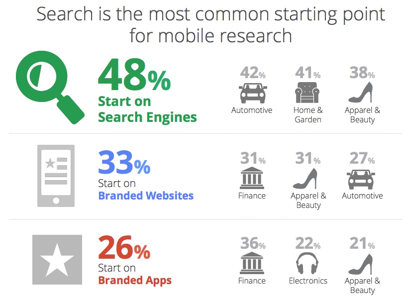
Google’s “Mobile Path to Purchase” study showed that the search channel – not branded apps – is, in fact, the most common starting point for mobile research (48 percent start on search engines).
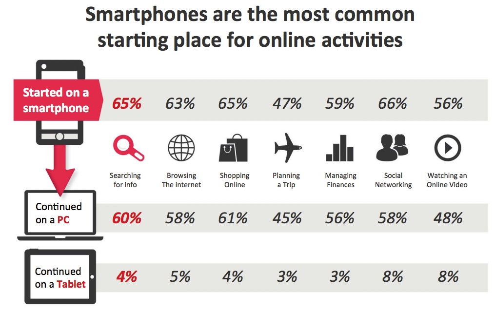
And, according to another study by Google (“New Multiscreen World”), 65 percent of consumers start their research on a smartphone, and 65 percent shop using the smartphone as the initial device, too.
This industry data is great, but it’s important to dive into your own website’s data, too.
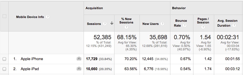
If you’re simply using Google Analytics, you can get a picture of how many people are coming from mobile, like smartphones and tablets, and what they are doing when they get there – specifically bounce rate, pages visited and conversions.
You can even see which devices are the top devices amongst your audience:
Further, in Google Analytics, you should drill down into your top-performing pages or the most important pages to your business, and see what the device makeup is for those pages just so you have a benchmark. It’s interesting to look at historical data month-over-month and year-over-year to see how this is growing.
OK, so you have a grasp on what your mobile users are doing on your site, and how many of them there are. Now it’s time to consider what you’re going to do with your site to enhance its mobile friendliness.
First, how will you configure your site? While responsive design is Google’s official recommendation, Google supports other types of mobile configuration, too. It’s our job to determine the best type for the job. Some configurations are more complex than others, which is why responsive tends to be the favorite for implementation.
Each type of configuration – responsive, dynamic or separate mobile sites – has its potential pitfalls. According to research coming from BrightEdge, they found that Google does not discriminate between different types of mobile configurations in terms of ranking.
As that post by Jim Yu points out (linked to in the previous paragraph), some brands are testing dynamically served pages, where the content is not just responsive to a mobile device, but custom made for mobile users:
Some brands have decided to implement more than one configuration to further personalize the mobile experience for visitors. For example, a site may choose to use responsive design overall, but selectively choose dynamic serving for a site’s most critical landing pages.
After you’ve determined a configuration (and maybe you’re already mobile), next on the list is to consider how site speed plays into the mobile experience. As many of us are aware, site speed is a ranking signal in Google’s algorithm. We also know that Google recommends that all above-the-fold content render in one second or less for mobile users.
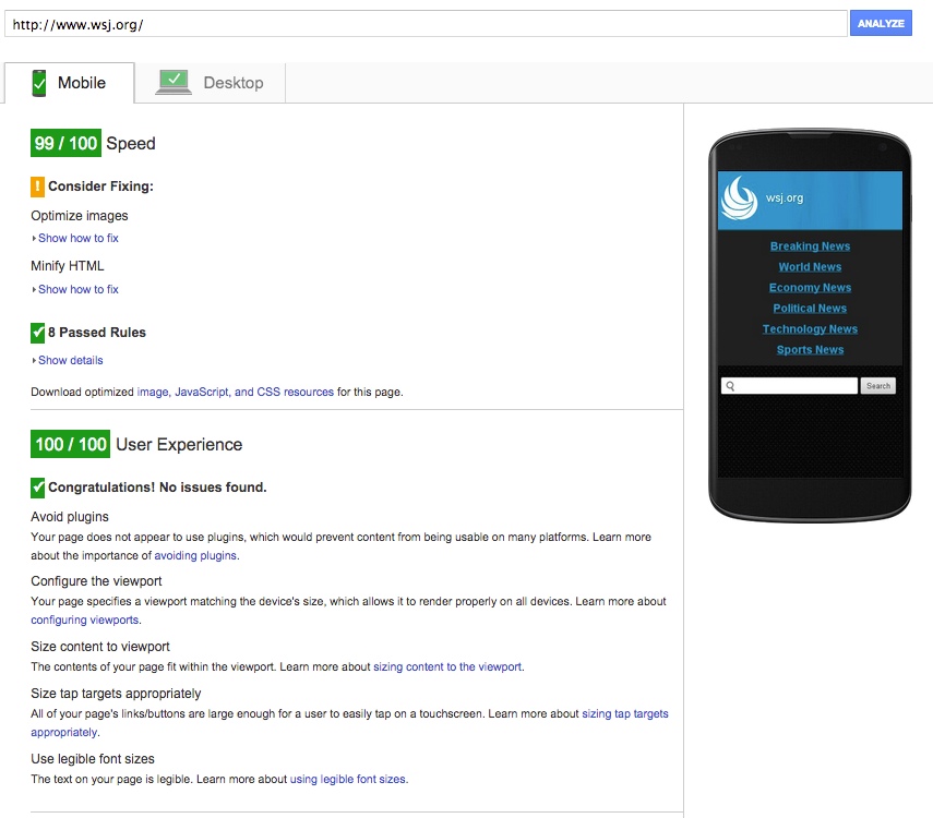
Because Google wants the mobile experience to be the best it can be for users, it provides a tool– PageSpeed Insights – that works as a grading system for the mobile experience that anyone can use on their pages.
Here’s an example of what the tool tells us using The Wall Street Journal online (they’re doing pretty darn good):
Regardless of which route you take, Google is quite helpful along the way with its guides and tools, like this one that can help analyze the mobile friendliness of a page.
So, the final consideration then is what type of content mobile users are truly looking for.
Consider your business and the industry you’re in. For example, if you’re a local brick-and-mortar, studies show that people are most likely looking for contact information and directions when coming to your site from a mobile device. In fact, according to Google, one in three smartphone users studied are looking for contact information on a site. So when designing, you may want to make that contact info front and center.
However, if you’re a B2B with information-rich content, for example, how you frame up your content could go a long way for mobile users.
Specifically, when it comes to landing pages (those high-value pages intended to convert visitors – be it to buy something or request a demo), conversion optimization pro Bryan Eisenberg likens desktop browsing to a full-course dinner, while mobile browsing is more like snacking, he says.
His opinion is that you want to be careful not to overdo it when it comes to mobile landing pages. More on that here:
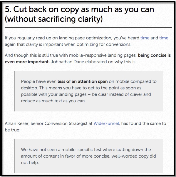
In this post at Unbounce, professionals weigh in on what makes a stellar landing page for mobile, and again content that is specific to mobile users is at the forefront. See the following comments from Johnathan Dane and Alhan Keser in this screenshot from that post related to how to treat content for mobile landing pages:
It certainly seems like we have been talking about the importance of mobile for some time now, yet the mobile Web experience is still a testing ground for brands to find the sweet spot in content and experience.
How will you respond to your mobile audience’s needs?
Update: Here is the latest announcement from Google on April 21 regarding mobile friendliness.
Jessica Lee
Jessica Lee is founder and chief creative at bizbuzzcontent Inc., helping B2B and B2C businesses realize the value of quality web content to their marketing plans. Sign up for tips on content strategy and writing delivered to your inbox directly from Jessica and the bizbuzzcontent team.
Leave a Reply